
Dashboard Overview
When you first log into the system, the first item you will see is the Dashboard. This is a broad visual overview of your business including opportunities, pipeline value, and conversion rate, and gives you a greater understanding of where your business is and where it is going.
As you scroll through the page you’ll see different tiles giving you information related to your business and be able to quickly view how your customers are moving through pipelines, how your Google Ads and Google My Business page are performing, as well as view tasks assigned to team members.
NOTE: Depending on your user permissions, you may not have access to all of the components.
Dashboard Data Tiles
Gather a high-level grasp of your CRM performance with the help of an informative dashboard! Decode each data tile that you encounter to understand how it can contribute towards boosting success. Here you’ll be able to view opportunities, pipeline value, conversion rate, and more - giving you an insightful view of all your current or potential customers to better understand your business performance.
Opportunities
Get insight into your lead Pipeline success with Opportunities - a powerful indicator of how effectively you're engaging potential customers! With just one click, you can quickly find out exactly how many opportunities were open, closed or lost during that time period.

Pipeline Value
Keep an eye on the big picture of your Leads' total worth! When entering opportunities, you can give each product or service in your business a value to then visualize the potential total sales in your pipeline.
By clicking through to a given date range, you can easily track and monitor your entire pipeline value – including its closed, open, and lost values. Get up-to-date insights into how much business is in progress at any time for running successful operations.

Conversion Rate
Unlock valuable insights into the health of your business by analyzing won leads and accounts. Easily customize date ranges by clicking on the dates to the right of where it says Conversion Rate to take a more in depth look at how many leads are converting in your selected time period. Conversion Rates offer an insightful comparison between won leads and total pipeline leads.

Funnel
Gain an insightful understanding of the journey your opportunities take through your pipelines with our funnel visual representation.
Select the pipeline you’d like to visualize by clicking on the dropdown to the right of where it says Funnel. You can choose a selected date range by clicking on the dates to the right.
Depending on the pipeline you select, you will then see an outline of each stage of your pipeline underneath the funnel. Here you will see the number of leads in each stage, the total value of each stage, as well as the percentage of leads in each pipeline stage.
If there are no opportunities present in your pipeline, then you will not see a funnel here.

Stages Distribution
This is a pie chart visualization of your pipeline.
You can select which pipeline you’d like to visualize by clicking on the dropdown to the right of Stages Distribution.
You can choose a selected date range by clicking on the dates to the right.
Depending on the pipeline you select, you will see an outline of each stage underneath the pie chart. Again you will see the number of leads in each stage, the total value of each stage, as well as the percentage of leads in each pipeline stage.
If there are no opportunities present in your pipeline, then you will not see a pie chart here.

Manual Actions
Keep track of your team’s pending manual actions with our comprehensive overview, giving you the power to view total counts and how they’re broken down between phone calls and SMS.
Easily narrow in on specific campaigns or workflows by selecting from the Select Campaign/Workflow dropdown.
You also have the ability to view individual assignee pending manual actions by clicking on the Select Assignee dropdown to the right.

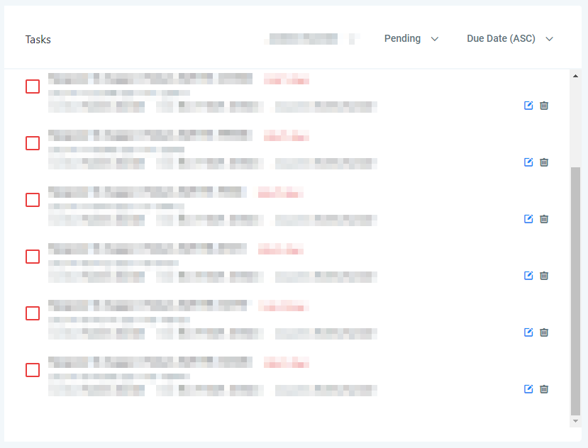
Tasks
You can view all tasks or select from the dropdown list and view the tasks corresponding to a specific team member.
By clicking on the pending dropdown, you can view tasks by status. You can also choose to view all tasks or completed tasks.
You can organize your tasks by clicking on Due Date to view tasks in ascending or descending order.
In order to see where all of your leads are coming from, make sure your integrations are set up in your CRM by going to Settings > Integrations. Here you can visualize where your leads are coming from, whether it is Google Ads, Facebook Ads, Google My Business, and more!
Lead Source Report
The Lead Source Report gives you a birds eye view of where your leads come from including the total number of leads, total value of leads from that source, as well as the number of open, won, and lost leads.
You can choose a selected date range by clicking on the dates to the right to visualize leads over specific periods of time.

Google Ads Reporting
If you have your Google Ads account linked inside your CRM, you will see a birds eye view of the performance of your Google Ads over the last 30 days.
This 30 day overview shows the total number of impressions, clicks, click through rate, average cost per click, as well as the total ad spend for that period.
To see a specific period of time, and to get a larger picture of how your ads are performing, check out the Reporting section.

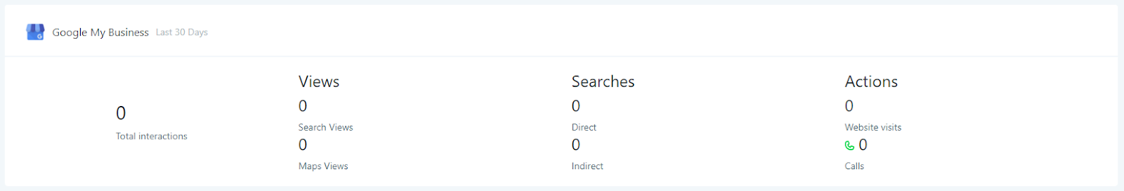
Google My Business
Get an insightful look into the performance of your Google Business Profile over the last 30 days.
This shows a quick glance at your total interactions, including search and map views, direct and indirect searches, website visits, and phone calls.
Google Analytics Data
Track your Google Analytics data over a 12-month period with this interactive chart that breaks down data by month. On the top you will see the total page views, including direct, paid, social, and organic traffic.
In the chart, you can see the total number of website views by month, also broken down by direct, paid, social, and organic traffic.

Website Visitors
Understand your website visitors better by digging into who is coming to your site and who they are. Here you will see valuable insight about user demographics like age, gender, device type and conversion rate.
The conversion rate shows the number of appointments in your calendars compared to the total visitors on your website.
You can view the number of visitors by device type, such as desktop, mobile, and tablet.
You can also view the number of visitors broken down by age group and gender in this section as well.
