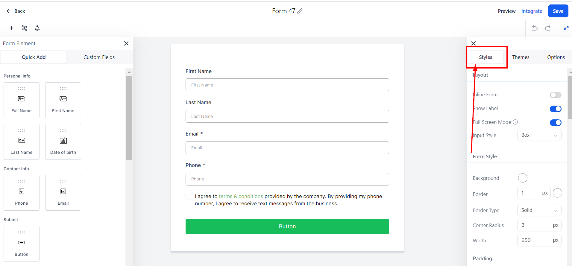
Styles Tab
To alter the visual aspects of your form, navigate to the Styles Tab within the form builder. In this section, you can tailor the appearance of your form by adjusting elements such as colors, borders, and additional design features. Customizing the look of your form allows you to create a cohesive and aesthetically pleasing user experience that aligns with your brand identity.
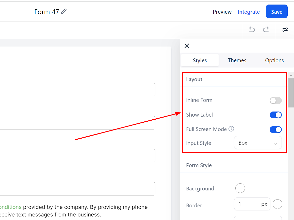
Layout
Here you will find your form layout settings. In this section, you can toggle inline forms and show labels on or off.
Inline Forms: Inline forms allow you to put form inputs side by side instead of all inputs below one another.
Show Label: If you do not want to show the input field label, turn it off here.
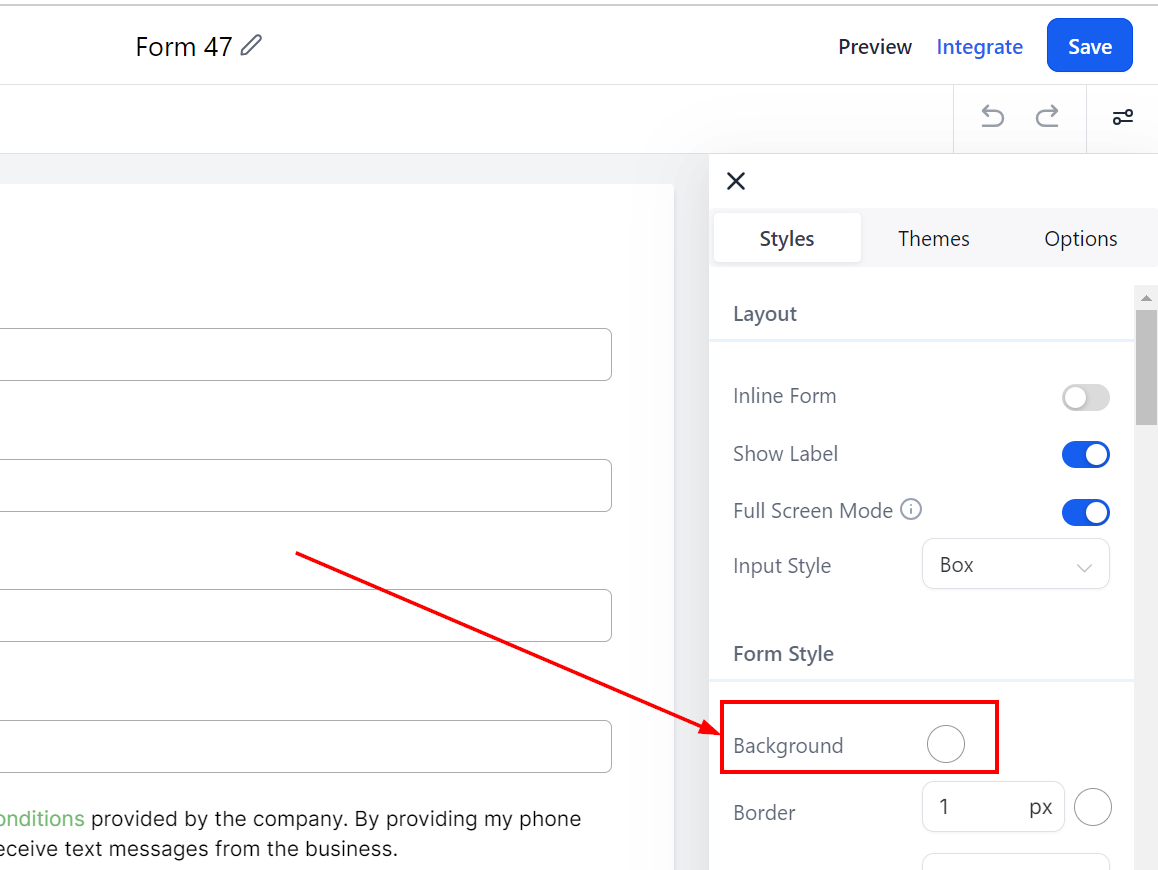
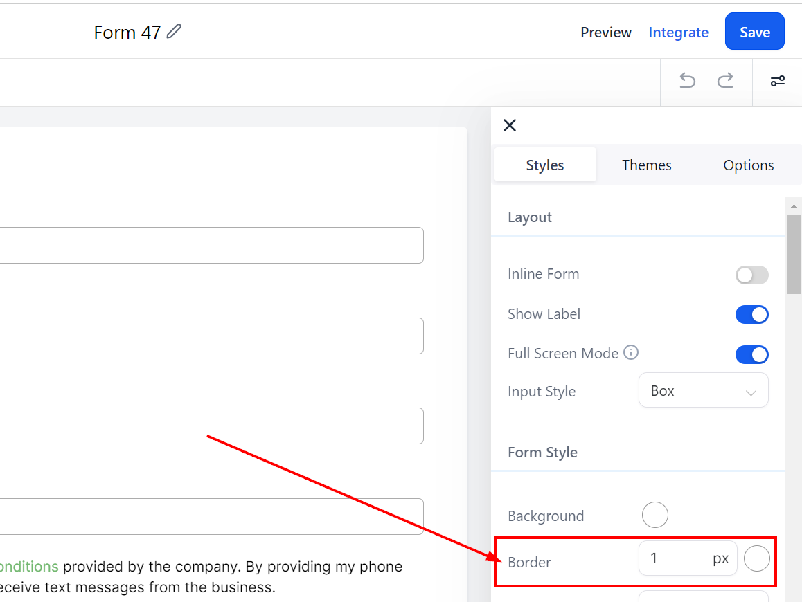
Form Style
Form Style - Background
In the Form Style section, customize the look of your form by adding borders and colors. To change the background color, click on the color box and select a color or add a custom code.
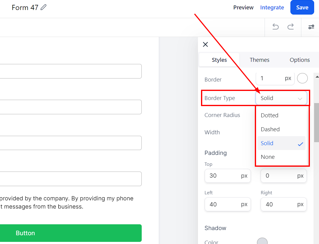
Form Style - Border
You can add borders by choosing a border type from the dropdown, such as dotted, dashed, lined, or none. The border width can be adjusted by adding a number or clicking the up and down arrows. To change the border color, click the color icon and select a choice or type in a custom code.
Form Style - Corner Radius
You can round the corners by adding a radius. Simply type a number in the given field. The higher the number, the rounder the corners will be.
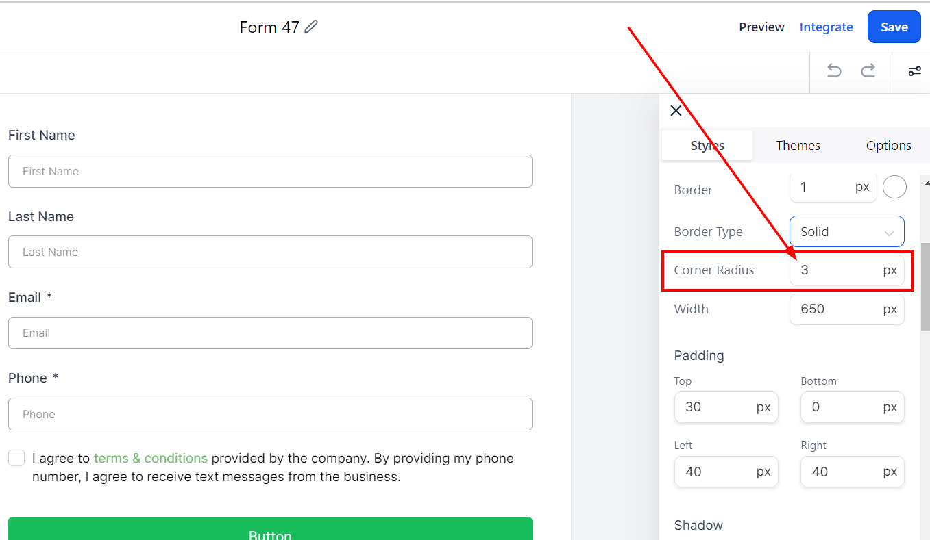
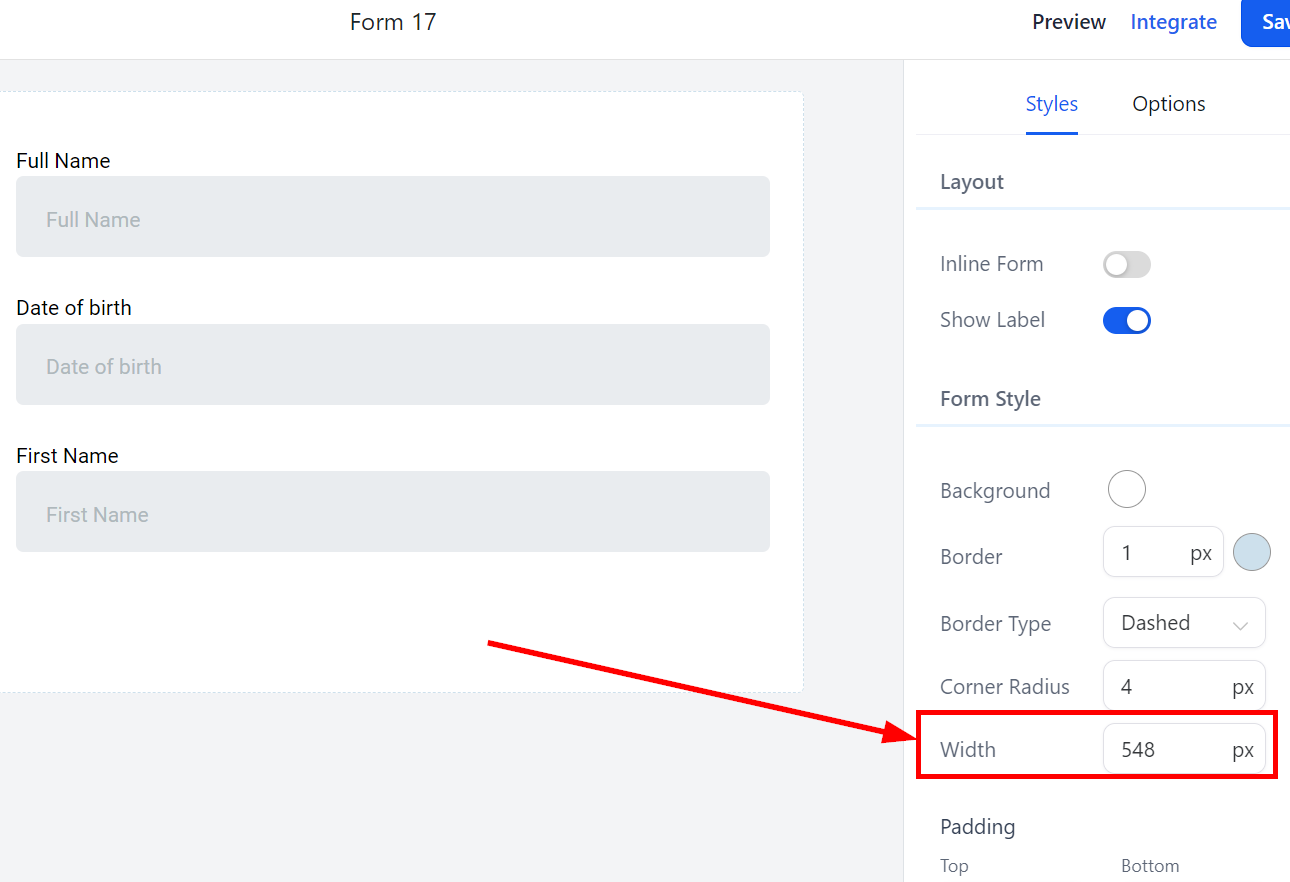
Form Style - Width
Modifying the form's width is also possible by adding a number in the given field. The higher the number, the wider the form will be.
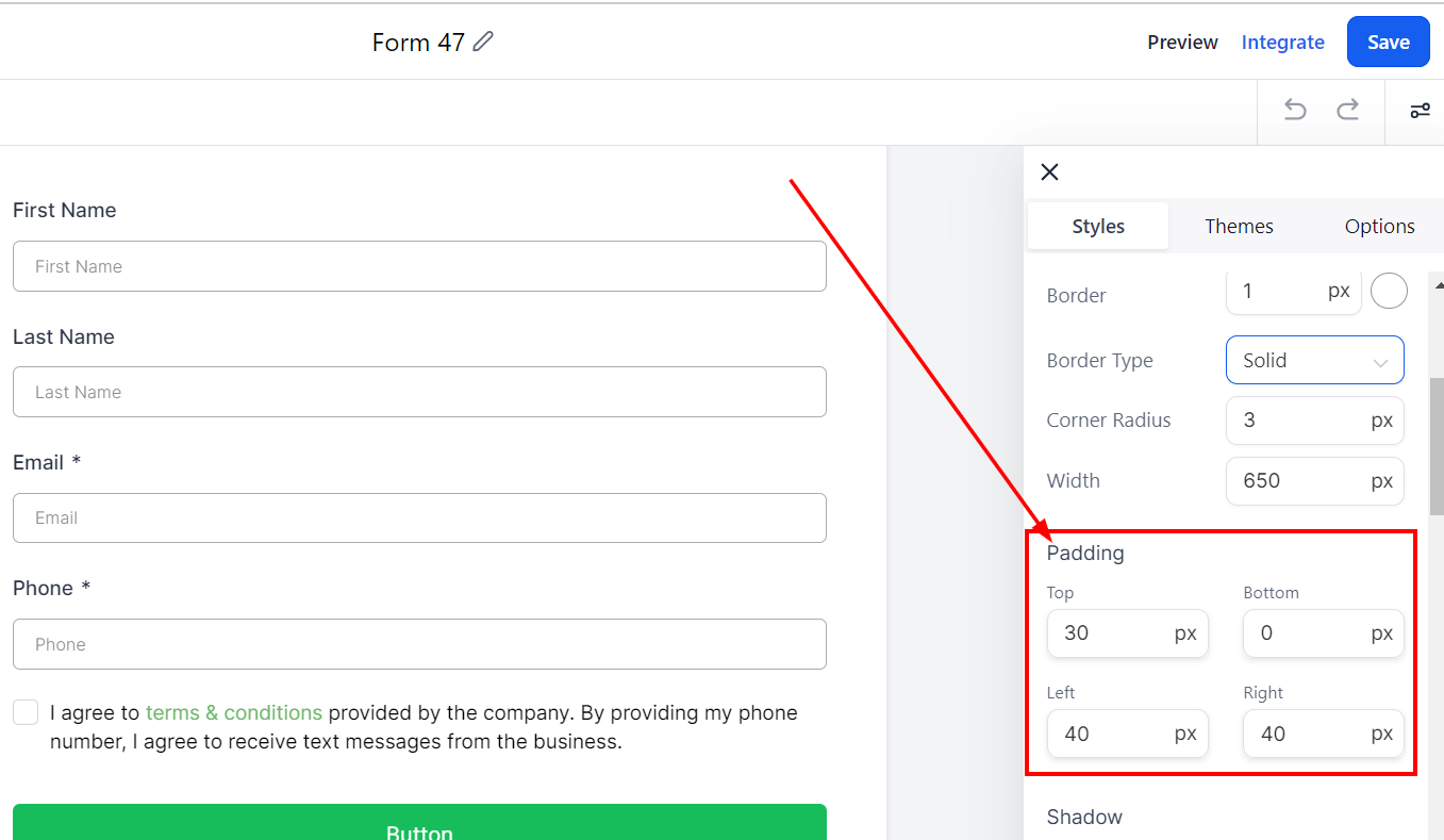
Padding
There are different spacing options available for adjusting your Form. Depending on the Edit option you are working on, the settings will only apply to that option. For example, editing the Bottom padding.
Padding Left, Right, Top, and Bottom
These four (4) different padding fields move the Form to the left, right, top, or bottom depending on the field you add padding. Simply type a number into the given field to add padding to the top, bottom, left, or right based on your preferences.
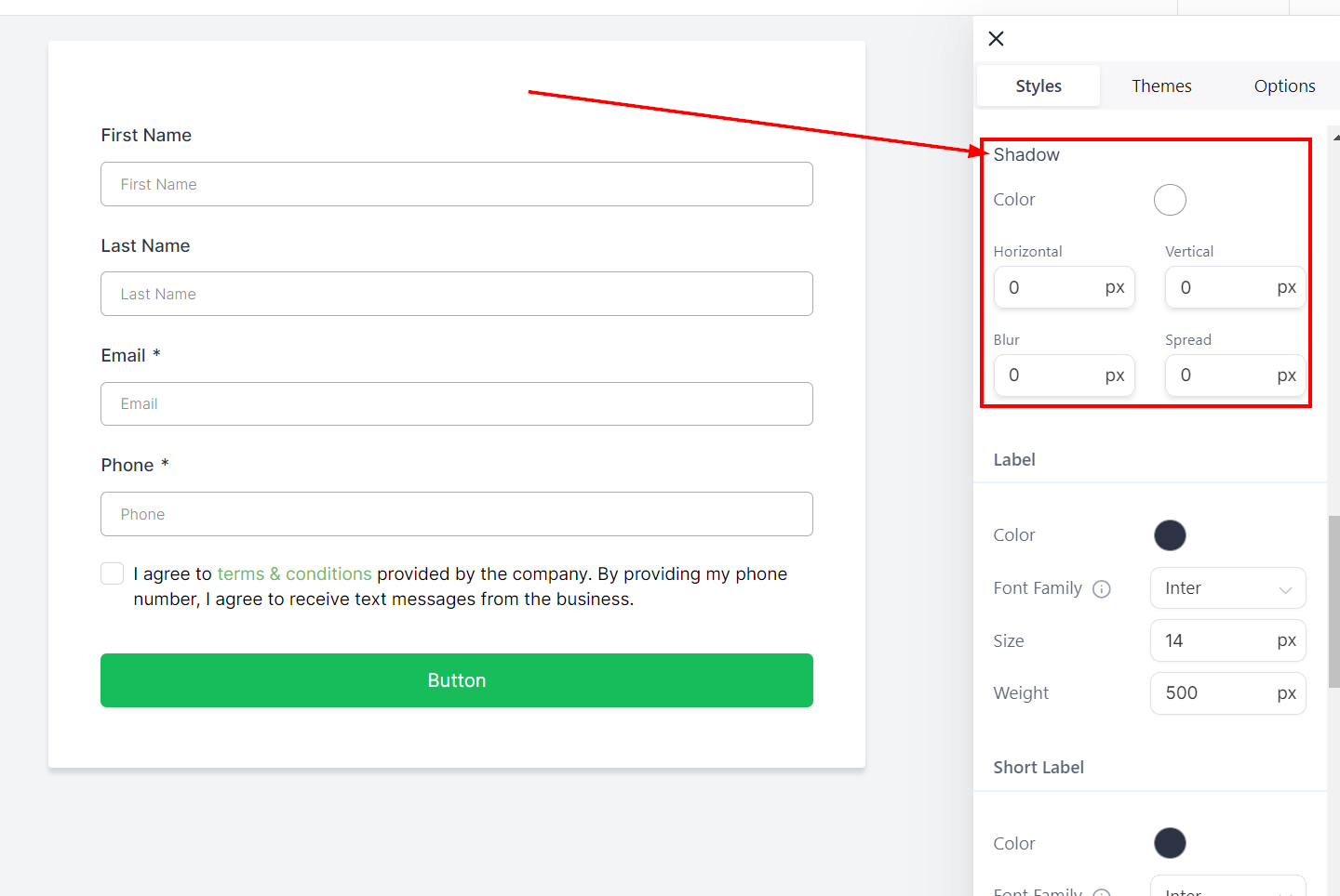
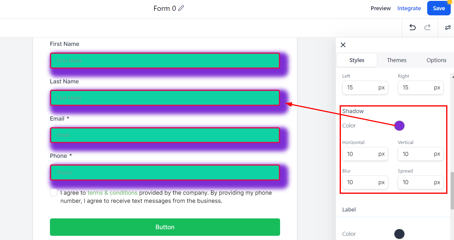
Shadow
It allows you to customize the border of your Form, such as the color, size, width, and radius.
Color
Color helps you choose a color for your border. Simply click on the color icon and select a color you would like to use or add a custom color code to match your company's branding.
Horizontal and Vertical
The width option allows you to select how thick the border is horizontally or vertically.
Blur
You can customize the edge of your border to make it blur and reduce the edge sharpness.
Spread
This will help you spread the corner of your border edge and make it curve.
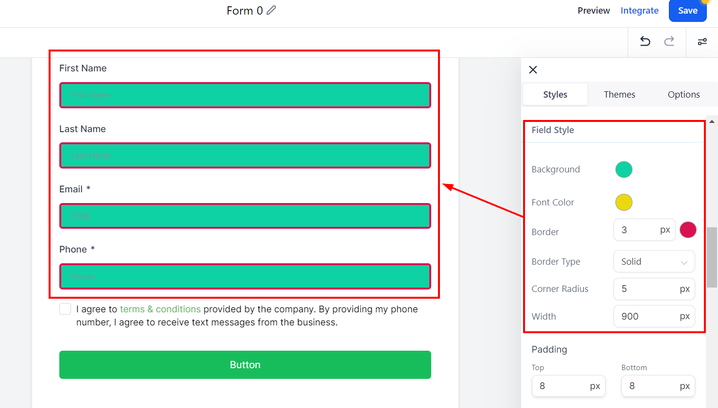
Field Style
Field Style - Background
In the Field Style section, customize the look of your form by adding borders and colors. To change the background color, click on the color box and select a color or add a custom code.
Field Style - Font Color
You can enhance the appearance of your form by altering the font color. Click on the color box to select a color, or type your custom color code in the given field.
Field Style - Border
You can add borders by choosing a border type from the dropdown, such as dotted, dashed, lined, or none. The border width can be adjusted by adding a number or clicking the up and down arrows. To change the border color, click the color icon and select a choice or type in a custom code.
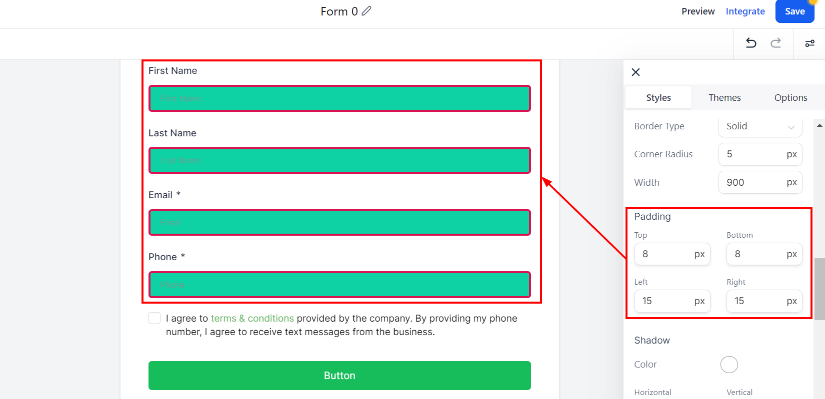
Field Style - Corner Radius
You can round the corners by adding a radius. The higher the number you type in the given field, the rounder the corners.
Field Style - Width
Modifying the form's width is also possible by adding a number in the given field. The higher the number, the wider the field width will be.
Field Style - Padding
Padding
There are different spacing options available for adjusting your Form. Depending on the Edit option you are working on, the settings will only apply to that option. For example, editing the Bottom padding.
Padding Left, Right, Top, and Bottom
These four (4) different padding fields move the Form to the left, right, top, or bottom depending on the field you click on. Simply type a number into the given field to add padding according to your preferences.
Field Style - Shadow
The shadow option allows you to customize the border of your Form, such as the color, size, width, and radius.
Color
Here you can choose a color for your border. Select a color by clicking on the color icon, or enter a custom color code to match your company's branding.
Horizontal and Vertical
The width option allows you to select how thick the border is horizontally or vertically.
Blur
You can customize the edge of your border to make it blur and reduce the edge sharpness.
Spread
This will help you spread the corner of your border edge and make it curve.
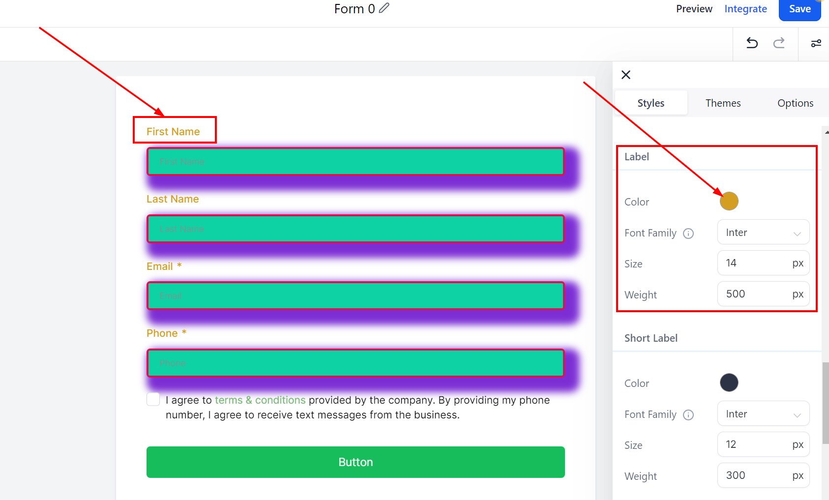
Label
Color
In the Label section, customize the look of your form by adding colors. To change the label color, click on the color box and select a color or add a custom code.
Font Family
This allows you to select the font style for your label. Click on the dropdown menu and select a font you would like to use for the field label.
Size
Here you can select the font size of your label by typing a number in the field.
Weight
This will help you bolden the font you chose for your label, making it thicker. Type a number into the given field to change the weight. The higher the number, the bolder the font will be.
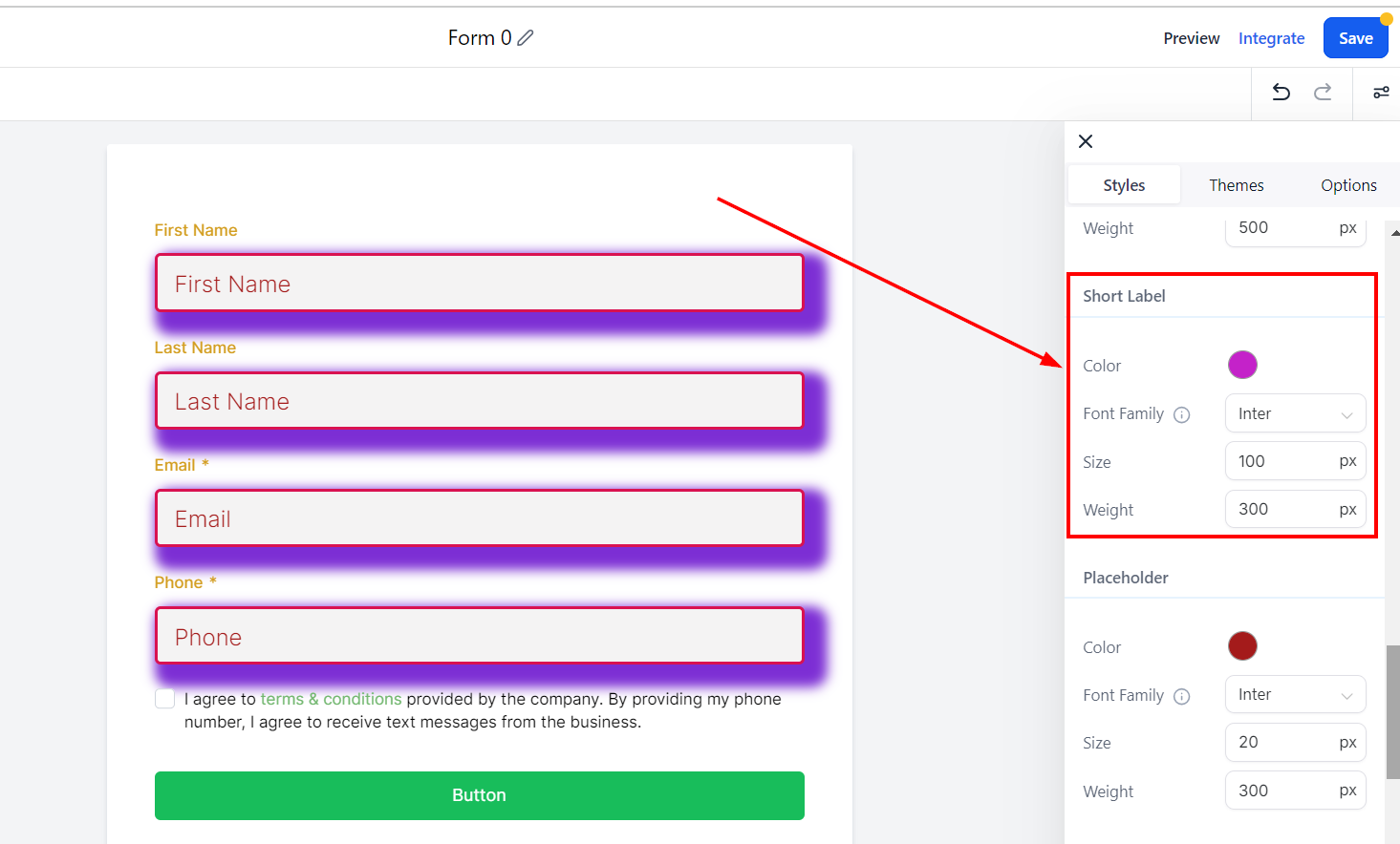
Short Label
Color
In the Short Label section, customize the look of your form by adding colors. To change the Short label color, click on the color box and select a color or add a custom code.
Font Family
This allows you to select the font style for your Short label. Click on the dropdown menu and select a font you would like to use for the field label.
Size
Here you can select the font size of your Short label by typing a number in the field.
Weight
This will help you bolden the font you chose for your Short label, making it thicker. Type a number into the given field to change the weight. The higher the number, the bolder the font will be.
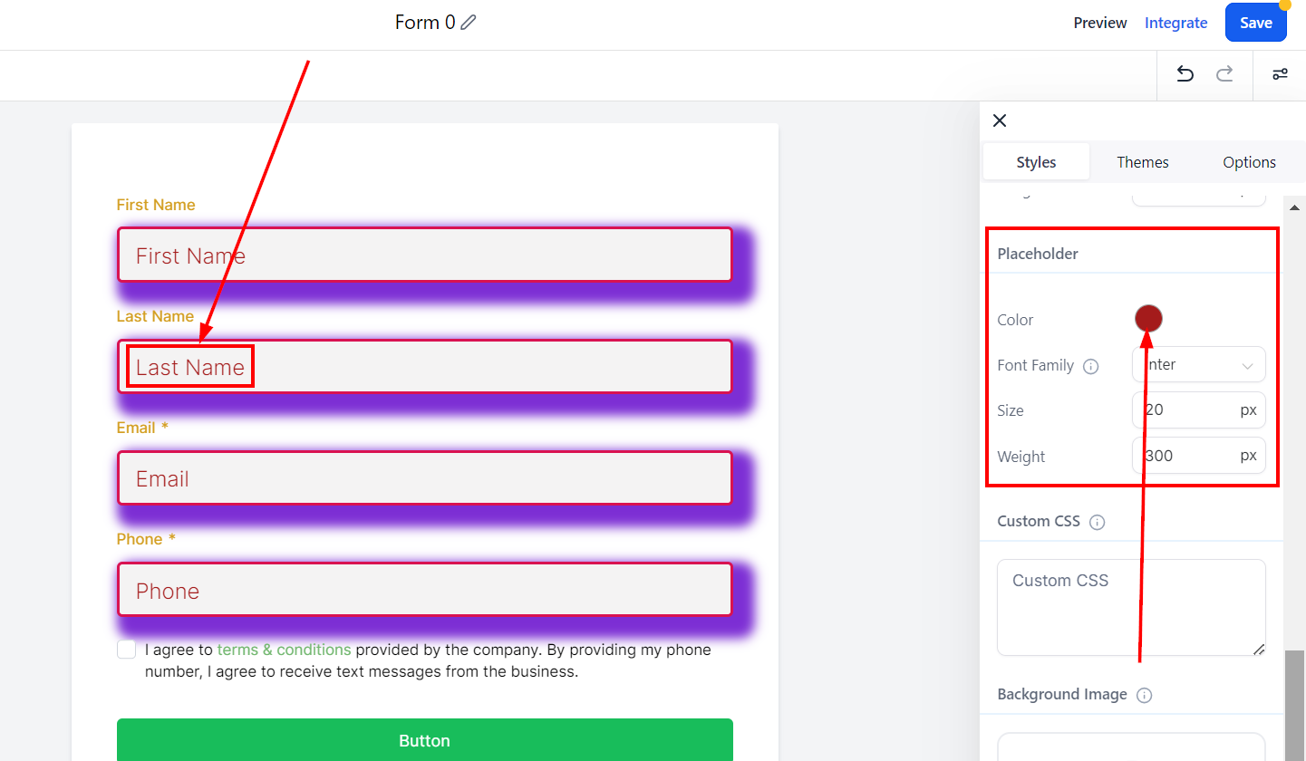
Placeholder
Color
In the Placeholder section, customize the look of your form by adding colors. To change the Short label color, click on the color box and select a color or add a custom code.
Font Family
This allows you to select the font style for your placeholder. Click on the dropdown menu to select the font you would like to use.
Size
Click on this section to select the font size of your placeholder and type a number in the box to set your font size.
Weight
This will help you bolden the font you chose for your placeholder, making it thicker. Type a number in the given field to add weight to the placeholder font. The higher the number, the bolder the font will be.
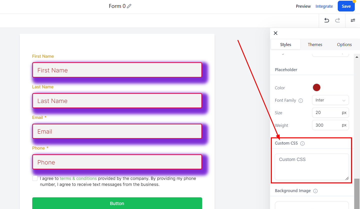
Custom CSS
You can add custom CSS to your form in the Custom CSS box to modify the design of your forms, such as input fields' shapes, colors, buttons, and more.
Consult with a web developer familiar with CSS if you are unfamiliar with this option.
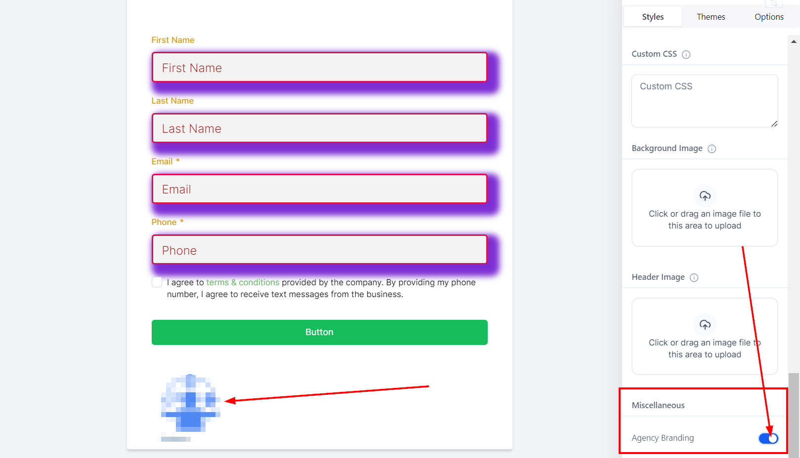
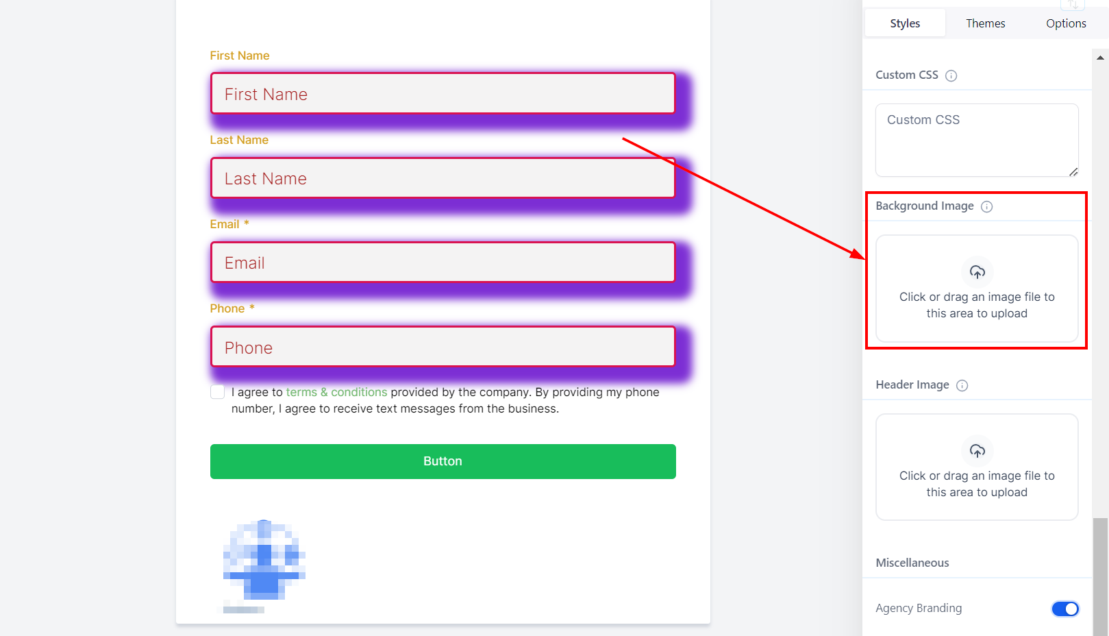
Background Image
The background image is intended to cover the entire page, providing a visually appealing backdrop for the form.
To view the background image, click on the Preview option.
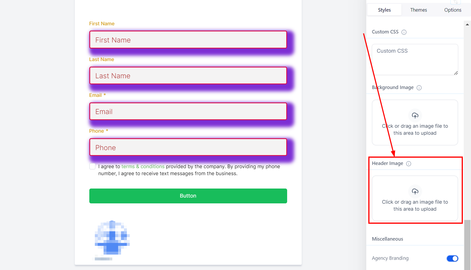
Header Image
The header image is designed to cover the entire width of the form and remains positioned at the top of the form.
To view the header image, click on the Preview option.
Miscellaneous
Agency Branding
In the Miscellaneous section, toggle on or off the company Branding option to show or remove agency branding at the bottom of your form. Turning it off allows you to place your form on a different funnel from the agency's.