Sub-Headline
General Settings
Incorporating subheadings into your content is a straightforward process. Simply click and drag the sub-headline element into the appropriate area within your editor's workspace. Once positioned, you can effortlessly modify its settings to achieve the desired appearance and structure for your page, enhancing readability and organization.
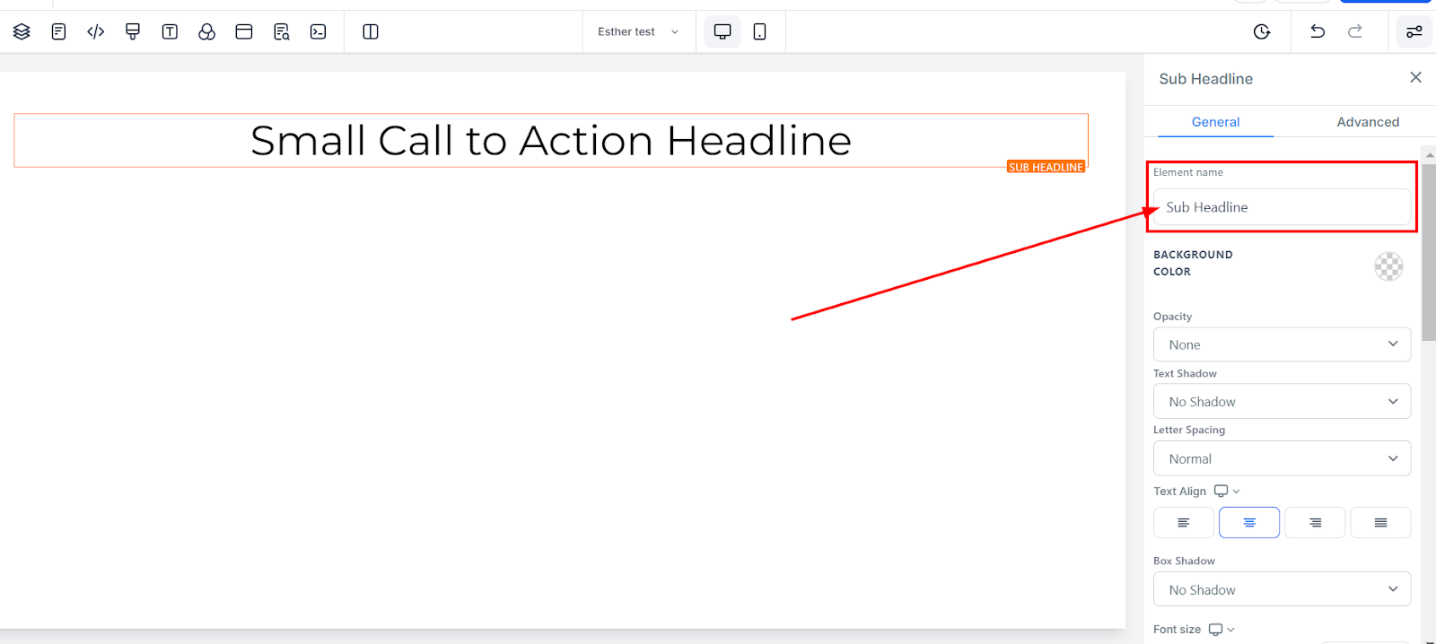
Element Name/Title
The edit toolbar for the selected element is located on the left side of the editor. The top of the screen displays the default name or title for the editing option that you can rename for easier navigation as you build your funnel page.
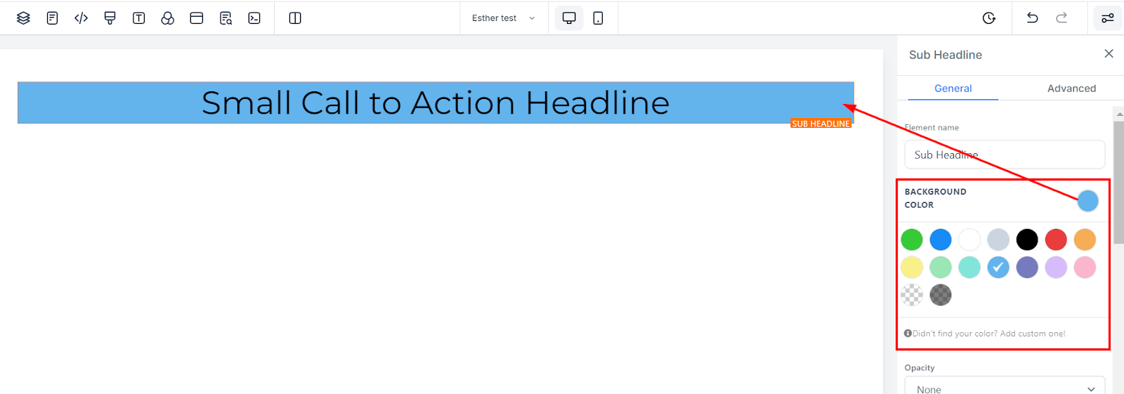
Background Color
To change the sub-headline background color, click on the content you want to adjust and choose the desired color.
If you can't find the desired color, add custom colors by entering the color code and clicking the add color button.
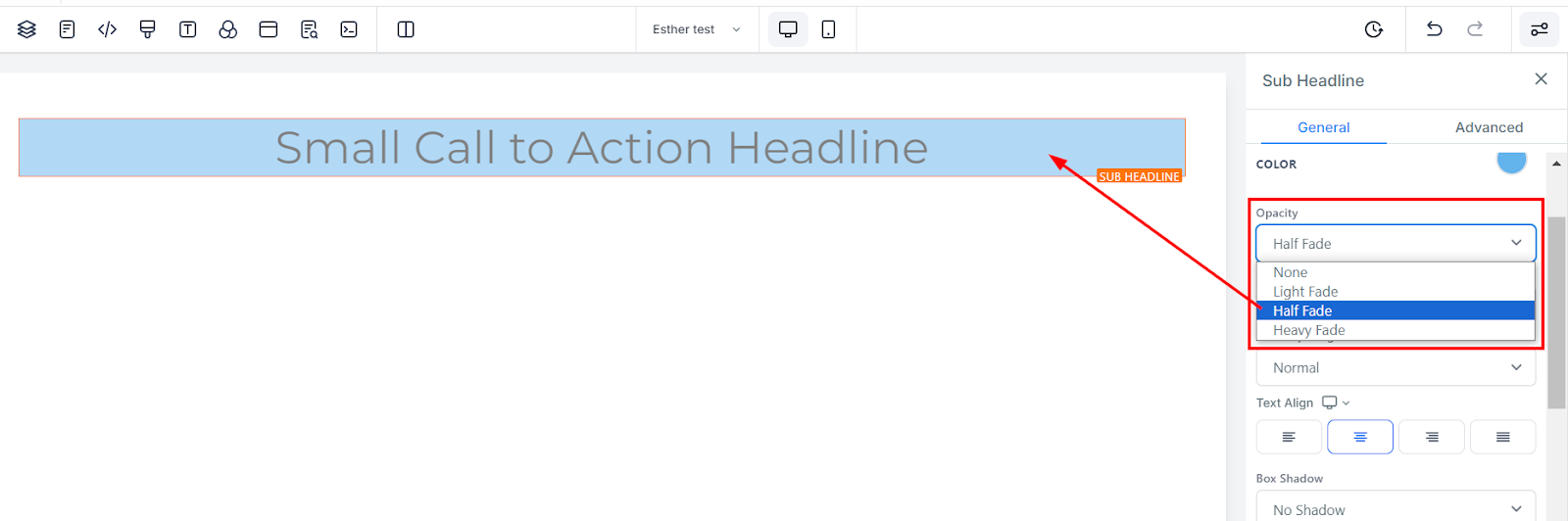
Opacity
To customize the transparency level in your element box content or text, utilize the opacity adjustment feature. You can choose from various levels of fading, such as None (completely transparent), Light, Half, and Heavy Fade (increasing opacity). This flexibility enables you to tailor the visual effect of your content to suit your preferences, creating a unique and eye-catching appearance.
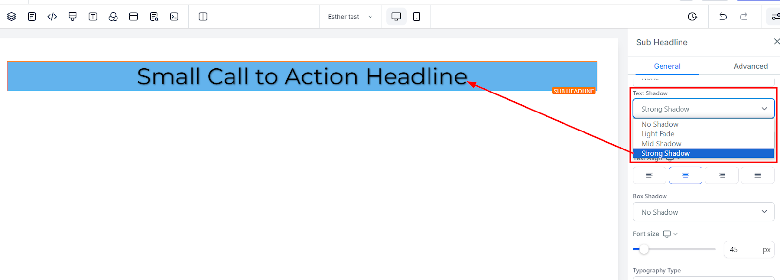
Text Shadow
To give your text or content an added element of depth and visual interest, utilize the shadow thickness feature. This option enables you to adjust the degree of shadowing applied to your text, allowing you to create a subtle or more pronounced effect as desired. By incorporating shadows, your content will stand out and capture your audience's attention, enhancing its overall appeal.
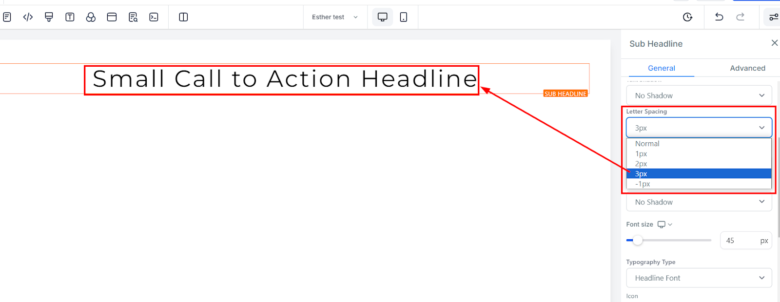
Letter Spacing
The letter spacing feature provides you with the ability to control the spacing between each character in your text. By adjusting this setting, you can choose to have letters closer together or spaced farther apart, creating a customized look and feel for your content. This feature allows you to achieve a consistent and visually appealing appearance across your content and elevate the readability of your text.
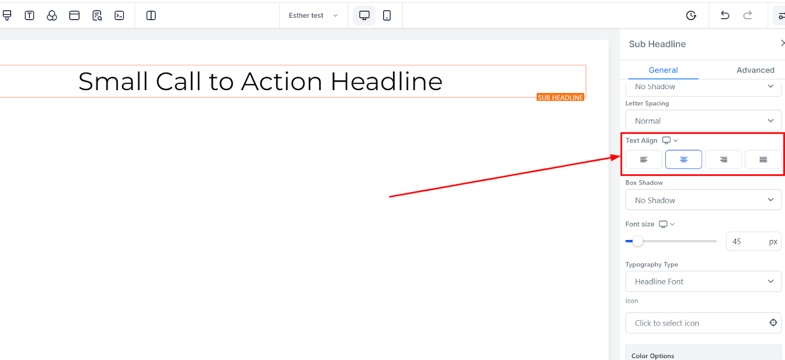
Text Align
To adjust the position of your text within your content, utilize the text-align editing option. This feature provides you with the ability to move your text to various locations, including left, center, right, or justified, according to your preference. By implementing this feature, you can ensure that your content is visually balanced and aligned, enhancing the overall readability and appeal of your text.
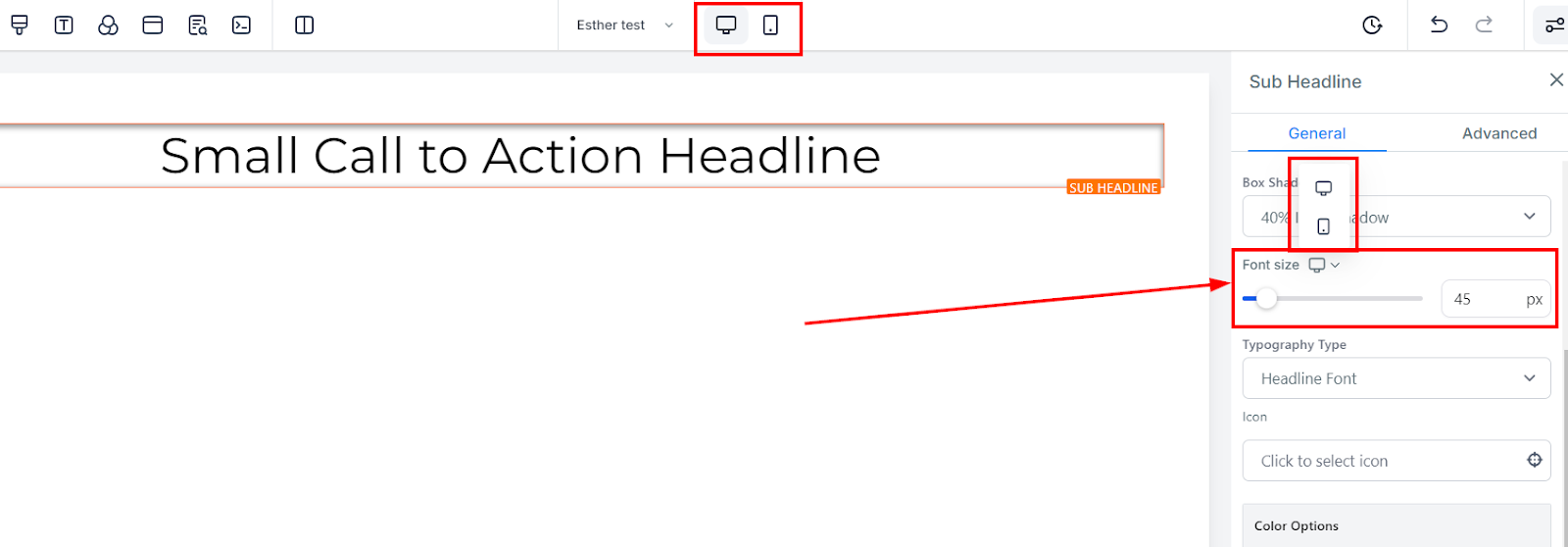
Mobile and Desktop Font Size
To change the font size for mobile and desktop devices, modify the size bars for each text or content element. Switch between mobile and desktop views at the top left corner of your funnel builder to preview how your edits will appear on each platform.
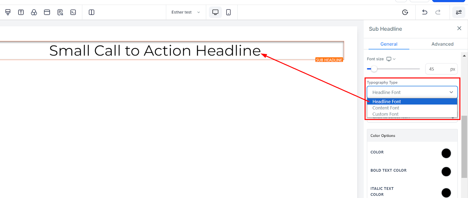
Typography Type
Incorporating a unique and visually appealing font is crucial in creating engaging content. With the option to select a sub-headline or content font from the settings or browse a range of typography fonts from the drop-down menu, you have the flexibility to tailor your content's appearance to meet your specific requirements. This feature enables you to choose a font that reflects your brand's personality or enhances your content's overall appeal, ensuring that your message resonates with your audience.
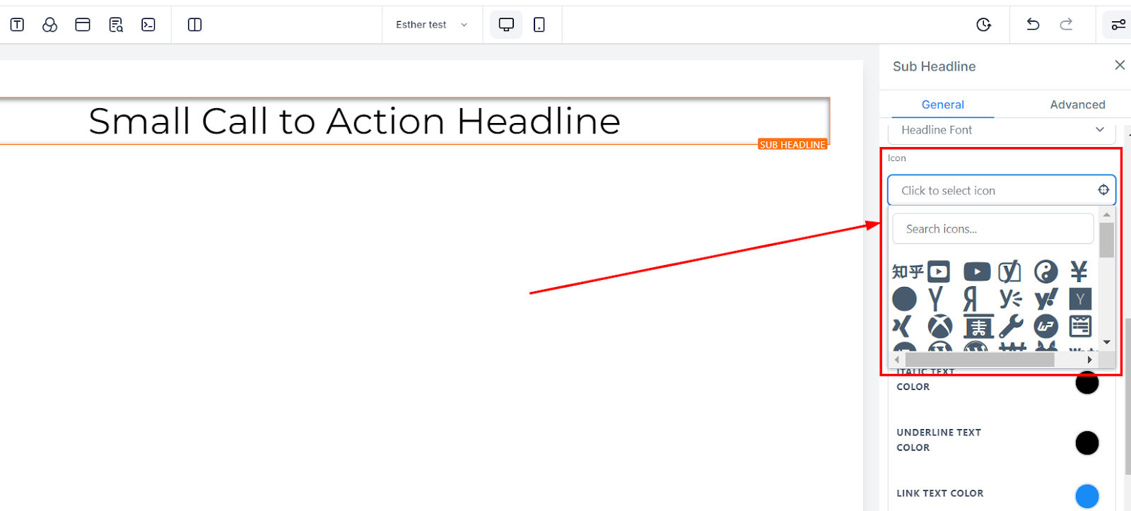
Icon
Icons are an effective way to communicate your message visually and capture your audience's attention. To incorporate icons into your page, simply select from the various available options provided. If you have a particular icon in mind, you can also utilize the search bar to narrow down your options and find the specific icon you require. This feature allows you to customize your content with relevant and eye-catching icons that enhance your message's impact.
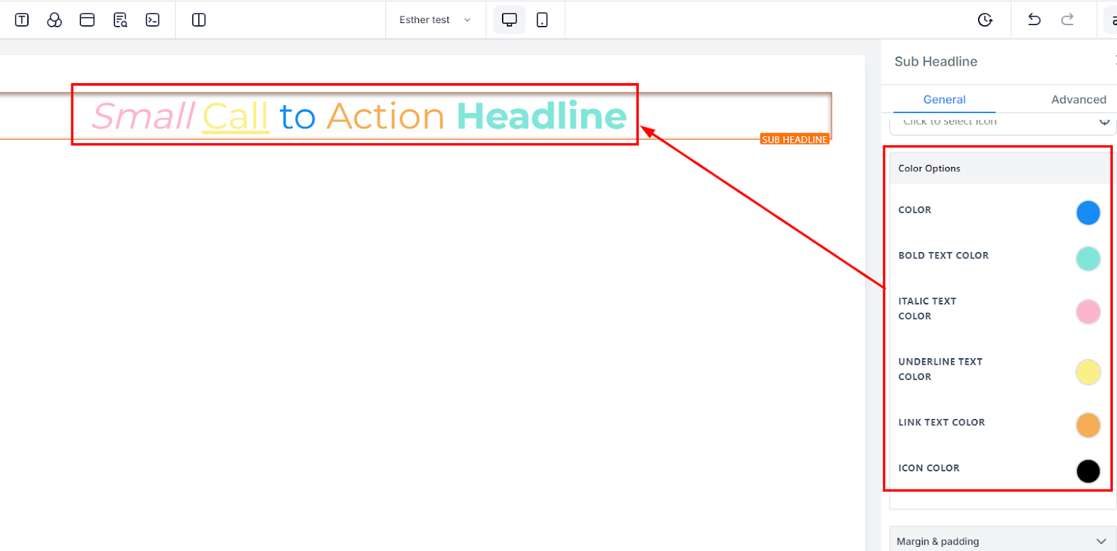
Color Options
Color
When a text isn't in bold form, you can only adjust its colors here
Bold Text Color
If a text is in bold form, you can only adjust its colors here.
Italic Text Color
You can only edit an italic text color here
Underline Text Color
You can only edit an underlined text color here
Link Text Color
If you have a link added to this page, you can only edit the link color here
Icon Color
If you have an icon added to this page, you can only edit the icon color here. Only the icon color will change regardless of the position it's placed.
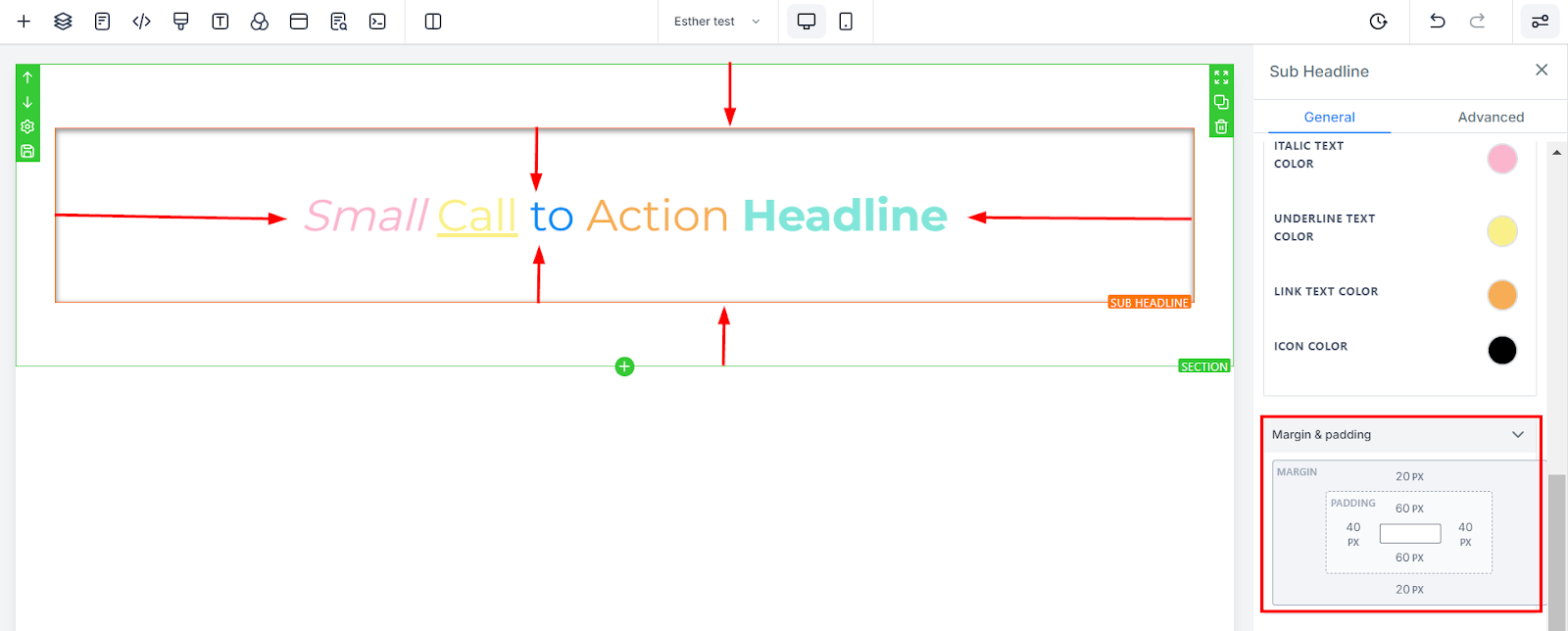
Spacing Option:
There are different spacing options available for adjusting your content. Depending on the Edit option you are working on, the settings will only apply to that option. For example, if you are editing a particular Row (the BLUE box), only every content in that Row will follow the command of what settings you make.
Padding Left, Right, Top, and Bottom
These four (4) different toggle bars move the content to either the left, right, top, or bottom depending on the toggle bar you click on.
Margin Top and Bottom
You can adjust the top or bottom margin of your content by toggling its bars.
Advanced Settings
Border Options:
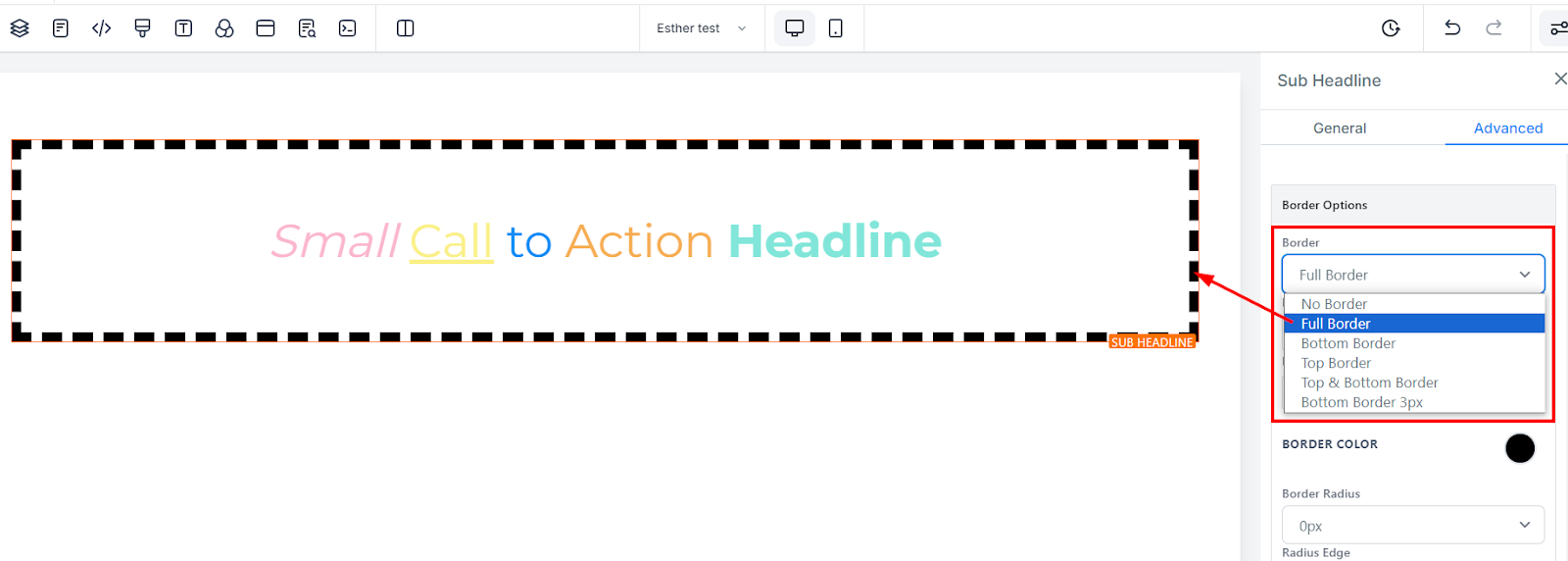
Border
You can choose the type of border you want. Once you select any of the border types, the settings for the border pop up;
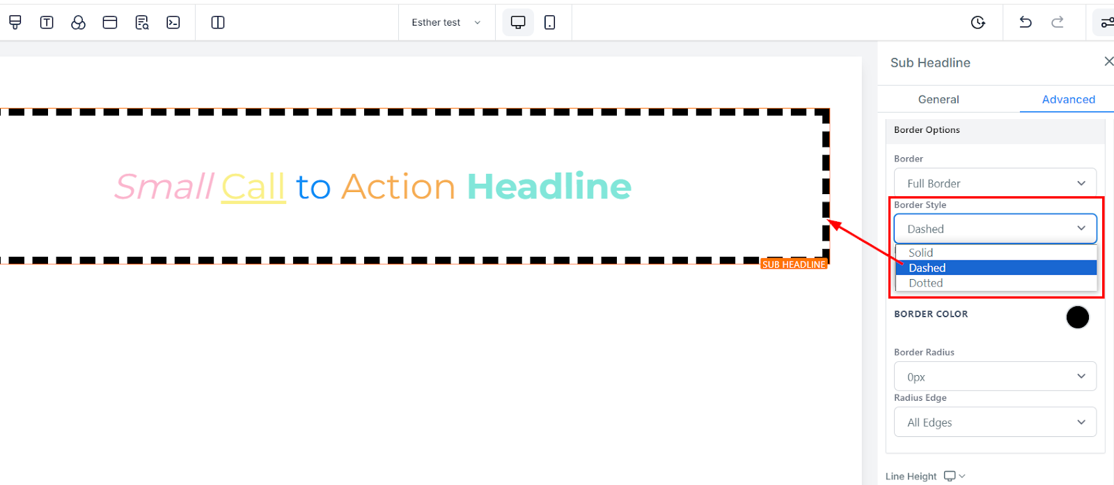
Style
There are three (3) Different styles for your border, It could be a solid, Dashed, or Dotted border.
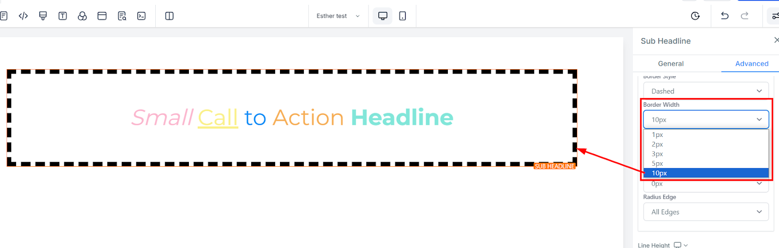
Width
When you increase the border width, it increases the thickness of the border.
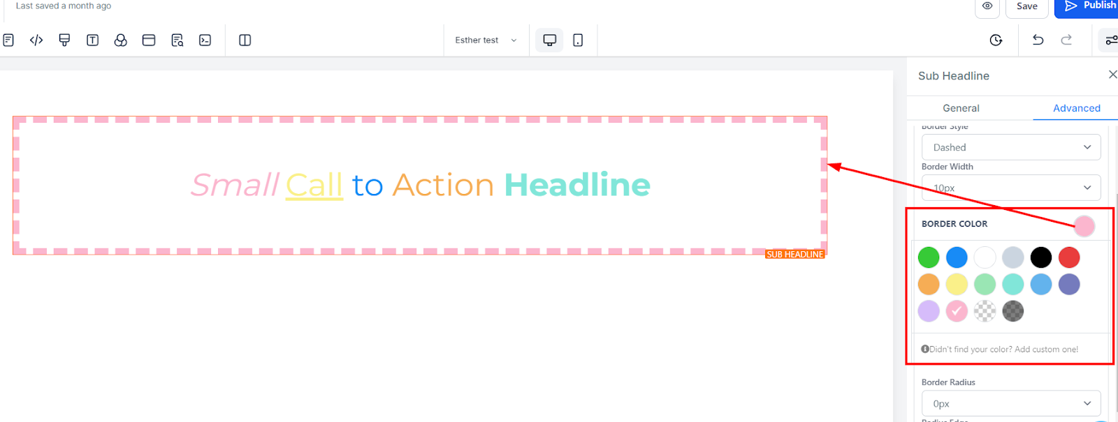
Color
To change the color of the border, click on this color icon.
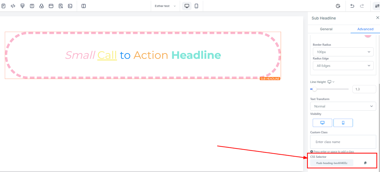
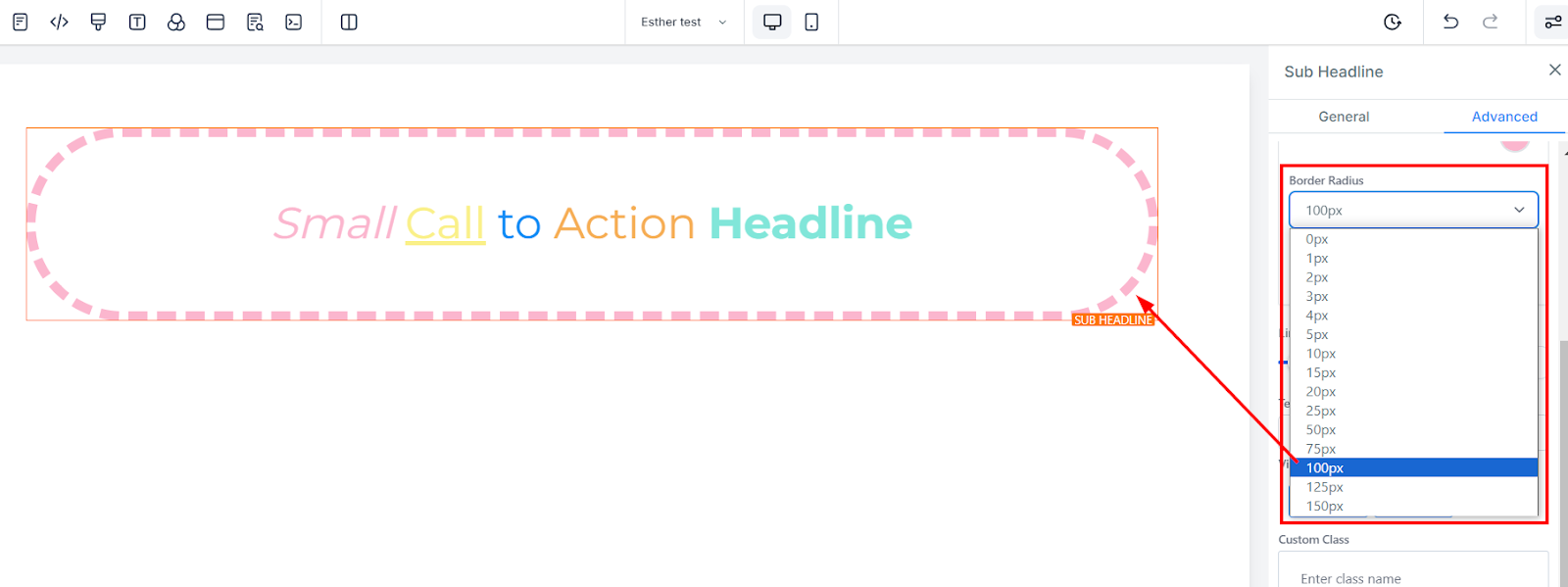
Radius
Adjusting the radius of your border curves the edges of the border, the higher the number you select, the curvier it becomes.
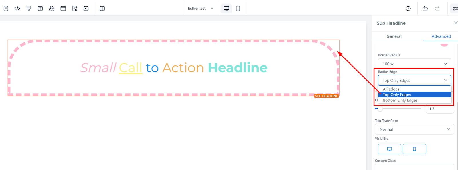
Radius Edge
You can decide the corner of the border you want to curve, either all edges, Top only, or bottom edge only.
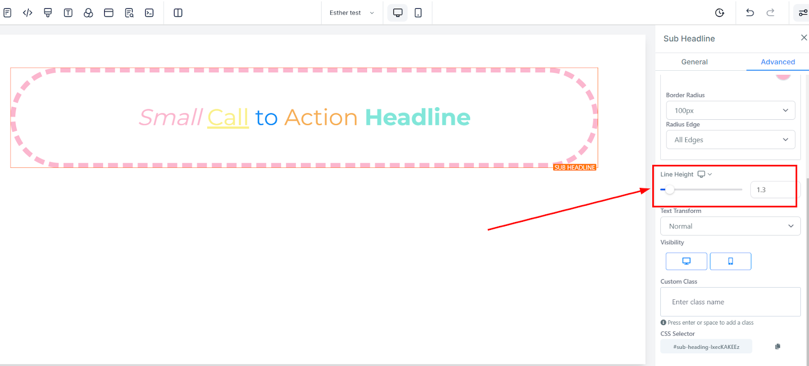
Line Height
You increase the height of the Element box by adjusting the size bar.
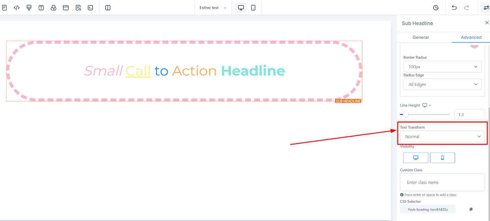
Text Transform
In the Text Transform, you can decide to change the text to Uppercase, Lowercase, or just capitalize each word.
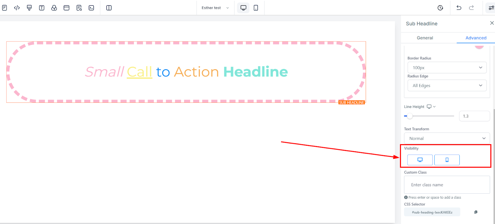
Visibility
The Visibility feature provides you with the ability to control how your page appears on different devices, whether it be desktop or mobile. By selecting the corresponding options, you can choose to make your page visible on desktop, mobile, or both devices, according to your preference. This feature allows you to tailor your content's appearance, ensuring that it is optimized for the device on which it is viewed. Whether you want to create a desktop-specific landing page or a mobile-responsive website, the Visibility feature makes it easy to achieve the desired effect.
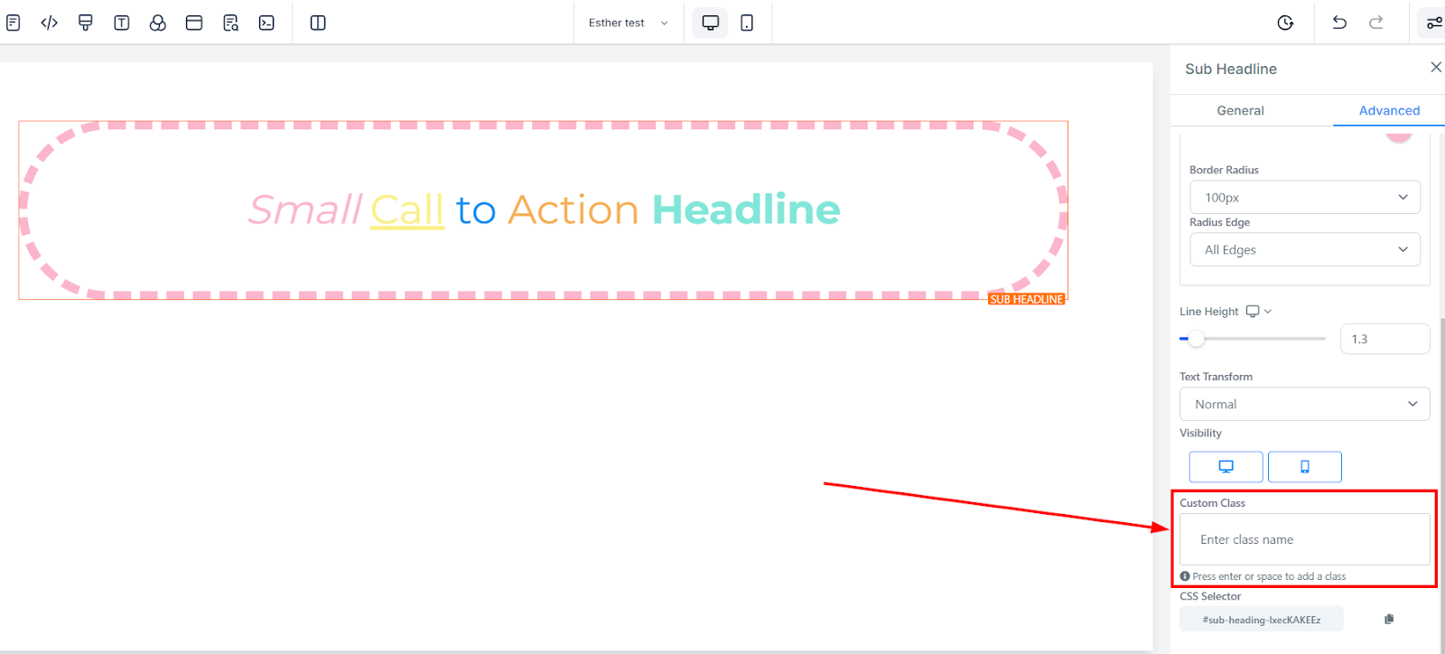
Custom Class
To enhance the functionality and appearance of your content, you can add a Custom Class to your page elements. This feature allows you to define a specific class name for your element, which can be used to modify its styling or behavior through custom CSS code. To add a Custom Class, simply fill in the designated field with your desired class name. This feature gives you the flexibility to customize your content to meet your specific requirements, enabling you to create unique and visually stunning pages.
CSS Selector
The process of copying a CSS Selector is made simple and efficient, allowing you to effortlessly copy your page elements with CSS code. This feature grants you the ability to identify the reference number of the element you want to modify and copy its corresponding CSS Selector directly to your clipboard. To take advantage of this feature, locate the copy icon on the right side of the desired reference number and click on it to copy the code.